
A visual analysis of New York City 311 Calls
NYC 311 Calls - A Visual Analysis


An interactive visual of NYC 311 calls.
Background
NYC receives 311 calls for non-emergency services from it's residents, businesses and visitors. The response time for these calls is longer than those for emergency (911) calls. Accordingly the resources allocated to these services may not be as highly funded, resourced and/or prioritized as the emergency services. It is why the NYC authorities need to optimize the use and allocation of the resources available to service these calls.
Objective
The goal of this visual analysis is to aid the NYC authorities in optimizing the use of the limited resources available to service 311 calls/requests. There are 3 dimensions chosen along which this optimization can be done, time, location and skill type.
Approach
IBM's Bluemix Analytics for Hadoop was used to load, cleanse and transform the data. Some static visuals were created in Bluemix (see below)
The data was then summarized and "condensed" to include the attributes needed to "slice" it by the dimensions referred to in the approach i.e. time (month of year), location (incident zip code) and skill set (inferred from complaint type). This summarized and condensed data was then uploaded to Tableau Public to visualize it.

Visualization
The visualization consists of 3 parts
- A bar chart of calls by complaint type in decreasing order
- A map showing the distribution of calls based on intensity of color
- An area chart showing how call volume changes by time, specifically month of the year
One can dive into specific zip codes and complaint types by using the filtering mechanisms of the map and bar chart respectively. One can also select multiple zip codes and complaint types to see how the call volume trends and/or contrasts Even though these criteria seem to be few the insights provided are quite revealing.
Lessons learnt
Some of the insights provided by the interactive visualization
- Although HEATING is the most frequent complaint in all of NYC
- "Street Conditions" has the highest call volume in the borough of Staten Island.
>

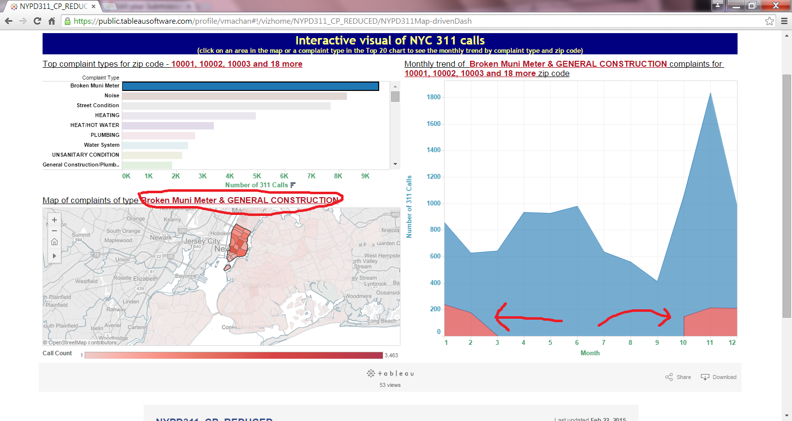
- "Broken Muni Meter" is the most frequent complaint in the borough of Manhattan
>

- When "GENERAL CONSTRUCTION" complaints rise from last quarter to first quarter the "Broken Muni Meter" complaints also spike (see below image)
>

- Although the monthly call volume trend for all of NYC for all complaint types spikes in the November timeframe, this is not true for all the complaint types and not for all boroughs of NYC
- The NYC 311 call data has requests from outside of NYC (e.g. zip codes from New Jersey). These provide a reason to investigate either the systems collecting the data and/or the policies governing the resources spent on requests from outside of NYC.

Even though the call volume for such requests is minimal, the potential changes to the systems and/or governing policies brought about by such findings can have a great impact on the working model of NYC authorities.
The above are just a few of the insights obtained without actually having deep knowledge of the workings of NYC departments.
Someone who is actually working for any of the NYC agencies can better "mine" the data using this visualization to quickly determine
- what areas are experiencing
- what kinds of problems and
- when do these occur more frequently.
This in turn should help NYC authorities (the target audience) to optimize the allocation of it's resources by
- location,
- time and
- by expertise/skills needed.
0 comments